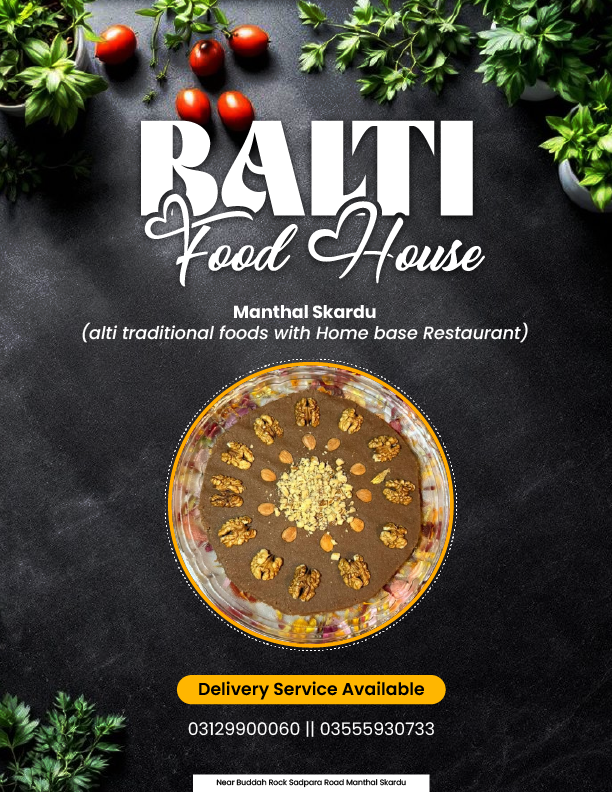
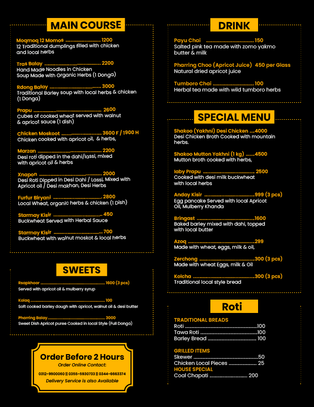
Balti Food House – Menu Card Design
This menu card design was created for Balti Food House, a traditional food service based in Gilgit-Baltistan, Pakistan. The restaurant specializes in authentic Balti cuisine, representing the rich culture and heritage of the northern regions where the Balti language is spoken.
The goal of this design was to visually reflect the authenticity, warmth, and traditional essence of Balti food while maintaining a modern and professional layout.
The design features:
- A dark textured background to create a premium and elegant look
- Fresh herbs and food visuals to highlight natural and organic ingredients
- A circular food collage showcasing a variety of traditional dishes
- Clean and structured sections including Main Course, Drinks, Sweets, and Special Menu
- A yellow accent color palette to enhance readability and create strong visual hierarchy
Typography was carefully selected to balance traditional identity with modern readability, ensuring the menu is both attractive and easy to navigate.
This project successfully combines cultural storytelling with professional design, making it ideal for local restaurants aiming to present their cuisine in a high-quality and appealing way.
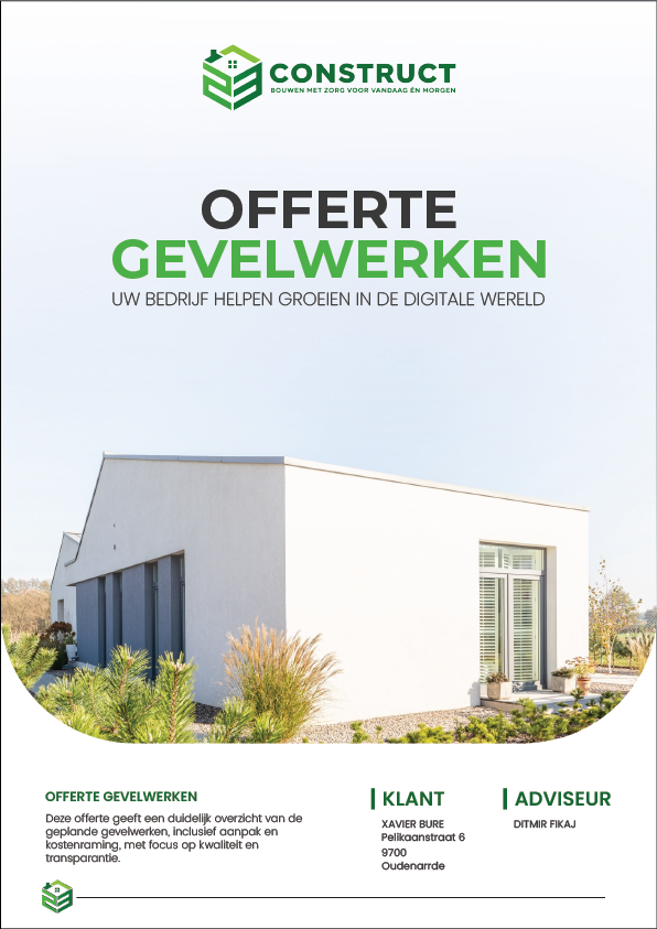
Construction Company Profile Design
– Corporate Brochure
This company profile design was created for a modern construction and facade solutions company, aimed at presenting their services, expertise, and brand identity in a highly professional and visually engaging way.
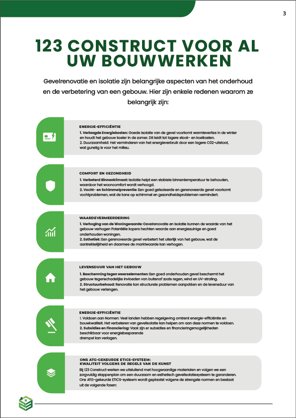
The primary objective of this project was to design a clean, structured, and corporate-style brochure that builds trust and communicates reliability—two of the most important factors in the construction industry.
The design follows a minimal and modern layout, using a well-balanced combination of white space and green accent colors to reflect growth, stability, and sustainability—core values associated with construction and infrastructure development.
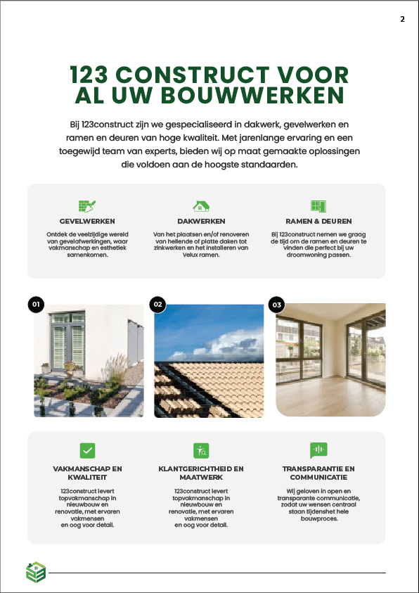
The profile includes multiple well-organized sections such as:
- Company introduction and overview
- Core services (facade work, construction solutions, and structural services)
- Key features and benefits
- Visual project highlights
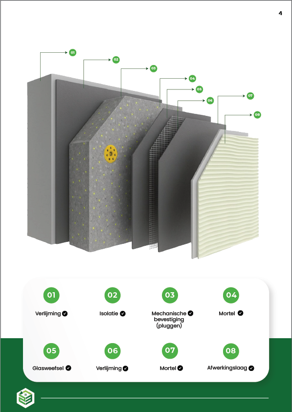
- Technical illustrations and process breakdown
Each page is carefully designed to maintain visual consistency and readability, ensuring that information is easy to understand while still looking premium and professional.
Key design elements include:
- Clean typography that enhances readability and corporate appeal
- Grid-based layout system for proper alignment and structure
- High-quality imagery and architectural visuals to build trust and authenticity
- Icon-based sections to simplify complex information
- A consistent green color palette representing growth, safety, and reliability
Special attention was given to spacing, alignment, and hierarchy to ensure that the content flows smoothly across all pages, creating a seamless reading experience for potential clients.
This project successfully combines modern design principles with strong corporate branding, making it ideal for construction companies looking to present their business in a professional, trustworthy, and visually compelling way.